Confirmed: Websites with Poor Mobile Usability Will Soon Lose Rankings
 Last week, Google announced that mobile-friendliness is about to become a serious ranking factor for mobile searches. This is more than geeky SEO news: this is a wake-up call for brands of all sizes. And Profound Strategy is helping business prepare with a limited number of no-obligation, hand-built Mobile Usability Action Plans, available on a first come, first served basis. Google started highlighting how well websites adapt (or don’t) to smartphone and tablet users this past November, when they rolled out the “Mobile-friendly” label. The gray text has been a gentle nudge for websites that are either responsive to mobile platforms or that redirect to a separate mobile site, but Google promised it wasn’t affecting rankings (yet).
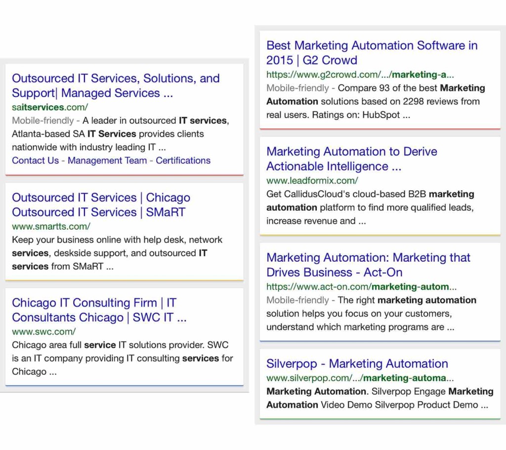 Mobile search results currently show mobile-friendly websites next to their not-mobile-friendly counterparts. Websites that lack mobile usability basics are set to drop in rankings after the April 21 algorithm update.
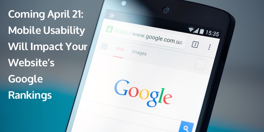
Now mobile-friendliness is about to affect rankings directly. In fact, Google is saying that mobile-friendliness, “will have a significant impact in our search results.” Google made the unprecedented move of announcing this ranking algorithm change before it happened. Mobile compatibility will start rearranging Google search results on April 21, so you have time to put together a plan and get your site ready.
Why Is Google Favoring Mobile-Friendly Websites?
Google is still all about delivering an unbeatable user experience, and mobile usage is only growing:
- 1/3 of organic search is now happening on mobile devices.
- 60% of internet traffic overall is happening on mobile devices.
- 18% of Millennials—who will be taking over the workforce in the next decade—are “mobile only” users, which means they do not own or frequently use desktop computers for internet access.
Mobile-compatible websites have been a best-practice since mobile internet access over-took desktop internet access at the dawn of 2014, but a year later, Google is adapting to—and thus speeding up—the trend. And it’s not just B2C. As mobile devices get smarter and Millennials move into more corner offices, the B2B marketplace will be routed if caught unprepared. In fact, mobile-friendliness is already a significant B2B marketing issue. Google’s own research found that:
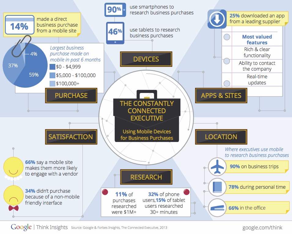
- 14% of C-Suites have completed a business purchase on a mobile device.
- 90% of execs have used their smartphones to research a business purchase.
- 34% of buyers did not complete a purchase because they ran into non-mobile-friendly interfaces.
 Google’s own research emphasizes the need to prioritize mobile SEO.
The popularity and power of mobile internet access is only going to continue growing. It was already a good idea to have a website that functions well across various devices. Google is just throwing in their chips to up the ante … and they happen to have a very large purse.
What Does a “Mobile-Friendly” Site Actually Look Like?
There are no closely-held secrets here. Google wants to deliver good content, on a responsive platform, to their users, so they are more than happy to tell you how to do it. It was the first thing John discussed in last week’s Google Webmasters Hangout.
He hit on a number of key mobile-friendly factors:
1 – Content Fits on the Screen
Users should only have to scroll up and down. No left-to-right, pinching, or zooming should be required to see the content on the page.  There are a few different ways to do that. John briefly discussed responsive web design, dynamic serving, and separate mobile sites. Technically any of them meet the requirement, but he did point out a clear favorite, based on some SEO basics:
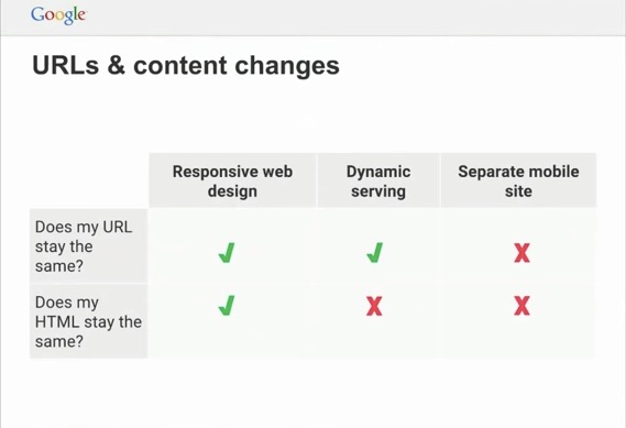
2 – It Doesn’t robot.txt Your CSS and JS
If Google can’t see the page, they can’t tell that it’s mobile-friendly.
3 – No Interstitials
If all Google can see is a CTA, you essentially block the bots from determining if the site is mobile-friendly.
4 – No Mobile-Specific Errors
Check your m.website.com pages for errors. Those errors have already been a ranking factor, but they’re also going to dock your mobile-friendliness.
5 – It’s Quick
Large content that slows down load time has always threatened your bounce rate and ranking (most mobile users will wait six to 10 seconds before bailing on your site), but now Google’s looking at speed as part of mobile-friendliness overall. Even with a detailed list of criteria, it seems outrageous that Google could possibly determine whether every site it indexes is mobile-friendly. But Google has been perfecting its algorithmic review of websites’ mobile usability for years, and this announcement would seem to indicate that they are pretty confident in its accuracy.
What You Need to Do: The Countdown to April 21
Mobile-friendliness will impact Google search rankings “significantly” beginning April 21, so you have time to check your site, develop a plan, and prepare to come out on top when it does. Google has provided some tools that will help you figure out how your site looks, and how to fix it:
- Google’s Mobile-Friendly Test is a simple, free website that will give your site a basic score, and some tips for improvement.
- The Google Developers Mobile Guide is a (very) complete guide that also gives you tips for working with a developer if you’d rather not take the whole thing into your own hands.
- The Webmaster Tools Mobile Usability Report will provide a full list of issues across your site, although you do need an account to access it.
In addition, I am happy to say that the Profound Strategy is standing by to offer a mobile-friendly consultation and action plan. If you’re not sure how to prepare your website for the April 21 update, please let us know. There’s no fee and no commitment required, but I would recommend that you let us know soon if you are interested – we expect there to be a high demand for this built-by-hand review over the next few weeks.
Mobile-Friendly Factor: Threat or Opportunity?
There’s still plenty of time to get your site ready for the April 21 deadline. You can explore the tools Google offers above, and our team is standing by to help you make sense of it all. Get in touch so we can help you be one of the “winners” after this algorithm update!
What's Next?
Profound Strategy is on a mission to help growth-minded marketers turn SEO back into a source of predictable, reliable, scalable business results.
Start winning in organic search and turn SEO into your most efficient marketing channel. Subscribe to updates and join the 6,000+ marketing executives and founders that are changing the way they do SEO:
And dig deeper with some of our best content, such as The CMO’s Guide to Modern SEO, Technical SEO: A Decision Maker’s Guide, and A Modern Framework for SEO Work that Matters.
Related Posts
 6 Mini Case Studies: How Leading Companies are Adapting to the Mobile User How are you reading this, right now? Statistically speaking, many of you are mobile. Is your brand ready for the mobile world? Are you meeting buyers on their terms, creating content for […]
 Will a Second Website Help My SEO Campaign? Here’s a question that comes up from time to time: Will a second website help my SEO campaign? You’re working on maximizing your SEO. Awesome. You’re looking at things like keywords and […]
 Google Drops Sidebar Ads: Full Summary of Impact for SEO The rumors are true: Google has dropped sidebar ads on their SERPs. Marketers have been watching what appeared to be some testing of the new format for a couple of weeks now. Last week, […]
 What Google’s New Deal with Twitter Means for Your SEO Google and Twitter struck an agreement last week that means more tweets could potentially reappear in Google search results. The deal provides a wealth of new content (i.e. a live stream […]